Since we started developing Shield Security, we focused primarily on security.
Our goal was to make Shield as powerful as possible. Since we eat our own dogfood here, having a reliable, powerful security layer is as important to us as it is to you.
But this focus on features had a detrimental effect on 1 key area:
– the User Experience
We’ve built a lot of power into the Shield plugin, but neglected to make this power easily accessible to everyone who wanted it.
We know that to challenge the incumbents, we have to deliver not only a better product, but we have to make it easy for everyone to use it.
We started the process of making it easier with our introduction of Shield Wizards.
We’ve received a huge amount of positive feedback on these wizards, and so we know we’re headed in the right direction.
The next problem for us to address was that of the UI…
A Fresh New UI Built On Bootstrap
Anyone paying attention to the past few releases will have seen the evolving changes to the plugin options pages.
Some feedback we received was positive, some negative.
We’ve been experimenting with several different approaches, but it always felt cluttered, disjointed and hard to use.
So we went back to the drawing board.
Our basic options display is easy to use. Each option has a name, a summary, and description. Most of them also have a link to either a helpdesk article or a blog post.
So we haven’t done away with this format as we know it works well.
However, clearly showing that Shield was comprised of different modules, each serving a particular role, had been difficult. And the old UI was a bit clunky and non-responsive for smaller devices.
We’d also found it hard to introduce extra plugin components to the UI, such as the Wizards and custom “action areas”, such as the Audit Trail Viewer and User Sessions.
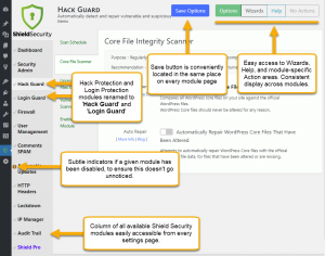
Shield’s new UI takes a slighly different approach to this and we’re hopeful that you’ll also find it easier to navigate.
It has a cleaner, more consistent layout, using less gaudy colours, and it’s responsive for even the smallest screens.
A Screenshot Summary
More To Come
This UI rebuild is the first major change and we trust you’ll like it.
But there is more to come, including a proper Overview Dashboard and Notifications area. But more on that at a later date.
This new UI will be available from Shield Security version 6.3.0
Of course, if you have any questions or comments on the new interface, feel free to let us know.


